


Danielle Clarke is a Toronto-based, contemporary realist oil painter. Her pieces can easily be distinguished by bold botanicals and striking female subjects. Clarke employs traditional techniques to create masterful, meticulous works. Simultaneously, Clarke seeks to call traditional beauty conventions into question and create work that is representative of real women; women who she knows. The Tri-Art Blog Team got the opportunity to sit down and chat with Danielle about everything creative; from palette to portraits.

Can you tell us about yourself and your work in a nutshell?
I am an emerging artist based out of Toronto. I got my BFA at York University. Since then, I have been working in the arts world and on my own work as well – I am a studio assistant to an artist, then I come home and work on my own paintings.
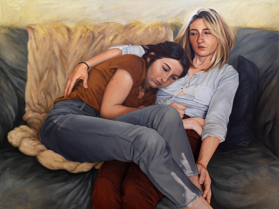
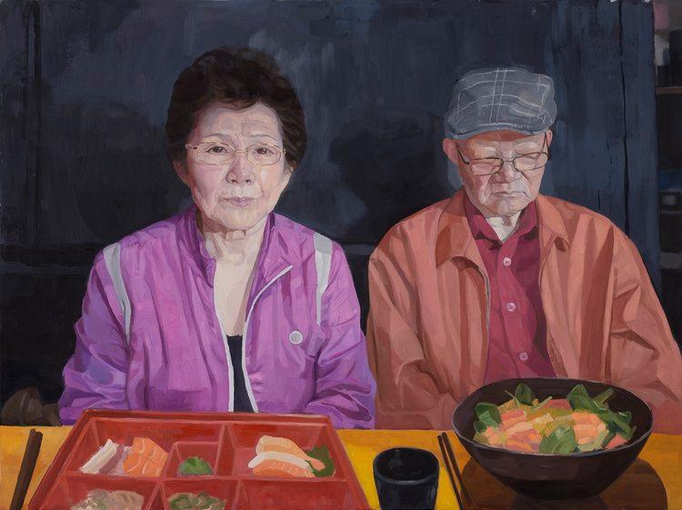
I mostly paint women who I know personally. I try to paint them in a way that empowers them, and not the demure figures that you see throughout art history.

How did you learn to paint? What did you find most critical to your development as an artist?
I learned to paint in high school, actually. I had an amazing classically trained art teacher – a very Renaissance kind of guy. He taught me how to paint in oils – everything I know is from him. From university I learned more of the conceptual side of things. In my third year of university, I went on exchange to Oxford Brookes University and that’s where I learned to really think critically about painting and how to develop my own practice, not just how to do school assignments. After graduation I also went on to work as an assistant to an artist that worked in acrylics – so I got training in multiple mediums. Acrylics are very transparent, so learned to do a lot of glazing, whereas I usually work opaquely in oils. I’ve since added some of technique this to my oil practice.
What influences your art? Where do you draw from creatively?
I’m inspired by the colours that come from contemporary art and art supplies. Bright colours like fluorescents are fun, especially to bring into more traditional technique.
I also like a lot of works by Toronto-based artists like Stephen Appleby-Barr and Keita Morimoto – colourful realist artists.
Tell us about your subjects?
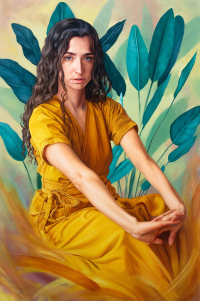
I like to paint people I know. I often throw little hints of their stories into my work. You can take it and run with it in different directions. For instance, The Yellow Dress is about a friend who went through a bad breakup and had to move out. Her sister bought her a plant after the breakup, so I’ve featured it in the painting. There’s also, Soteria, another friend of mine. She was going through some very personal struggles – her sister saved her from a very scary situation.
How do your subjects react to your works?
Most of the time I get, “oh my goodness that’s me, look at all the lines on my face!”
Many years ago, I painted a series of works with a subject that had a facial difference. She was born with Treacher Collins syndrome. After I finished the work, she told me it was first time she had really looked as herself and felt beautiful. She told me she used to take art classes - she would see beautifully rendered portraits, but no one who ever looked like her. Seeing her portrait in a gallery, she finally felt seen. It was enough to make me cry!

What role do botanicals and textiles play in your work?
I really like the detail in fabrics - I like to lose myself in the intricacies of it. I really like to paint fabric with a lot of pattern and capture the way it wraps around in three-dimensions.
As for plants, the first painting I really delved into it was The Green House. I’m interested in capturing the variation in plants – large juicy leaves vs. small leaves, different shades of green, and details. I also like to use them to compose an image, but also to add hidden meaning, like in The Yellow Dress.

Do you think that painting plants helps with portraits?
Green is not a very common colour in portraiture. Sometimes in Old Master portraiture you see painting that uses green as base for red glazes that make browns, but I wasn’t used to green on my palette. When I started using green in plants, I also started seeing it in skin more. When you paint a face, you’ll sometimes notice very common areas where the colours shift; red in the cheeks, but also blue-green around the chin. I started to notice that a lot more when I started to paint with green. For the longest time I didn’t even own green paint – I would just make it with yellow and blue. You need more than just yellow and blue to get a good variety.

You look like a very organized painter. How does that inform you colour choices?
I like to be able to see all my colours in comparison to each other - I’ve organized my paint above my workspace on a board - it makes it easier to stay in the flow. I used to keep all my colours in a bin, and I never could find the one I wanted. Sometimes I need to be able to quickly shift the tone of a colour I’m using. I can look and see that I have a warmer red, for instance, and change my mix.
I have a very standard, but slightly long, palette:
- Cadmium Lemon Yellow, or Bismuth Yellow
- Yellow Ochre Pale
- Burnt Sienna
- Transparent Red Oxide
- Cadmium Red, or Cadmium Red Hue
- Alizarin Crimson (Hue)
- Quinacridone Magenta
- Dioxazine Violet
- Ultramarine Blue
- Phthalo Blue
- Sap Green.
I try to avoid Cadmium pigments if possible, so if possible, I opt for colours like Bismuth Yellow and Cadmium Red Hue.
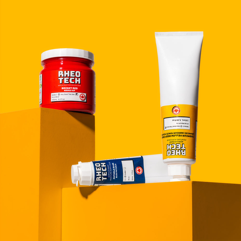
Shop the colours Danielle uses:
Pro tip from Danielle: a little touch of Quinacridone Magenta in your ultramarine blue will add a really zap to your blue colour.
What about mediums?
I work with a three-part medium: alkyd, solvent and linseed oil. I start with more more alkyd rich medium and add more linseed as I add layers.
Shop the materials you'll need to paint like Danielle:
How do you build up your painting?
I work in an alla prima style, usually using two or three layers. I aim to nail it on the first layer, but it’s never quite good enough. I usually work opaquely, but I also add layers with transparency. Before painting, I work out my composition using Photoshop and Procreate. I find it very helpful to solve all the problems before starting the painting, so I don’t have to work through them on the canvas.
It looks like your work plays with both hyperrealism and abstraction can you tell us about that?
I really like getting into rendering. If I can capture the luminosity and dimension of something, then I’m proud of myself. But abstracting something is very challenging. It’s outside my comfort zone. I find it beautiful - it looks the loosest and effortless, but it’s the most difficult.
Do you like to work on a large or small scale?
I like to work larger – you can get into it more. Larger works also consume your field of view. However, I’m often restricted by an easily transportable size. For some works I have consciously thought about shape and scale. In Curves I wanted it to be the size and shape of a bathroom mirror. My friend sent me a picture of her new tattoo taken in bathroom mirror. She has scoliosis and has had to have it corrected her whole life; she’s never felt happy with her back. To change that she’s embellished her back with these tattoos. I wanted the scale of the painting to capture a true to life moment, my friend looking at her new tattoos in her mirror.

Any tips for working small?
When working small, the trick is to keep unified lighting, but use a focal point to concentrate your detailed work.
How do you know when a painting is done?
This is hardest question. Some people say, “When it’s sold.” I think it’s done when it’s reached a point when all I can do is make it different, but not better. If it starts to get overworked and gets built up in a way that doesn’t work. Sometimes less is more – and I’ve been working on let those areas stay. Not everything needs to be completely rendered.
1 comment
Dale Morish
I find your portraiture extremely meaningful. You are very talented!
I myself am a wildlife artist but oils are such a challenge for me. Your use of oils is flawless and very well done.
All the very best in all your future endeavours. 😊 Again I am so impressed.
I find your portraiture extremely meaningful. You are very talented!
I myself am a wildlife artist but oils are such a challenge for me. Your use of oils is flawless and very well done.
All the very best in all your future endeavours. 😊 Again I am so impressed.